
Table Of Contents
What Is Gantt Chart In Excel?
A Gantt Chart in Excel is a type of chart used to define a project’s start and completion time with further bifurcation on the time taken for the steps involved. The representation in this chart is shown in bars on the horizontal axis.
Excel doesn’t provide an inbuilt Gantt chart. Therefore, we can use the 2-D Stacked Bar Chart that has the duration of tasks represented in the chart.
For example, to keep track of an event organized, we can use the Gantt Chart to check the timings and the events proceedings, as shown in the image below.

As shown above, if the time is 11.30am, we know that it is the Speaker’s speech going on, and next is Lunch time. We can easily visualize.
Key Takeaways
- A Gantt Chart in Excel is a type of Bar Chart that helps us understand the step-by-step progress involved in a project from the start to the end and the time taken for each stage’s progress.
- The Excel Gantt Chart helps us see the progress of the different stages in one single picture, and understand in which stage the progress of the project is.
- In a dataset, the tasks must be limited to create the chart. Or else, with the increase in tasks, the chart will get more complex and difficult to understand.
How To Make A Gantt Chart In Excel?
Gantt Chart is very simple and easy to use. Let us create a Gantt Chart In Excel for some scenarios with examples.
Download Template
This article must help understand Gantt Chart in Excel with its formulas and examples. You can download the template here to use it instantly.
Example #1 – Track Our Programme Schedule
Below are the steps to create a Gantt chart in Excel:
- We must first create agenda data in the Excel sheet. We start by entering the day’s activity in the worksheet. Next, list each hour’s activity, including when is the start time, what is the topic, what is the duration time, and the end time
The image below shows only the “Start Time” and “Duration of the Activity”. The “End Time” is only for our reference.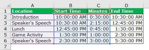
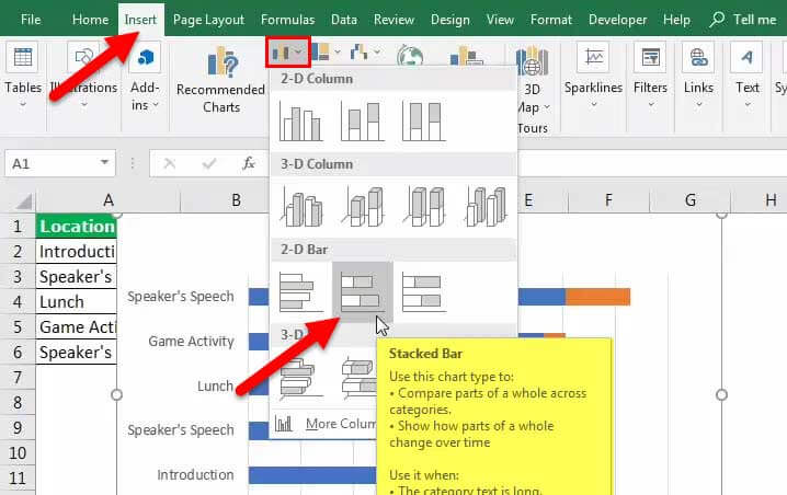
The steps to create a Gantt Chart in Excel are as follows: - Step 1: First, select “Start Time” (B2:B6) and insert a bar chart. Then, go to the “Insert” tab, and choose the “Stacked Bar” chart.
As soon as the chart is inserted, it will look like the one below.
Step 2: After this, we need to tone more series to the chart. Now, right-click on the chart and follow the below steps.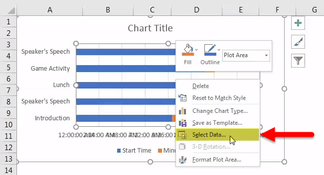
Step 3: The “Select Data” pop-up will appear. Next, click the “Add” option, and select the “Duration” series. The below image will guide us in choosing the duration data series.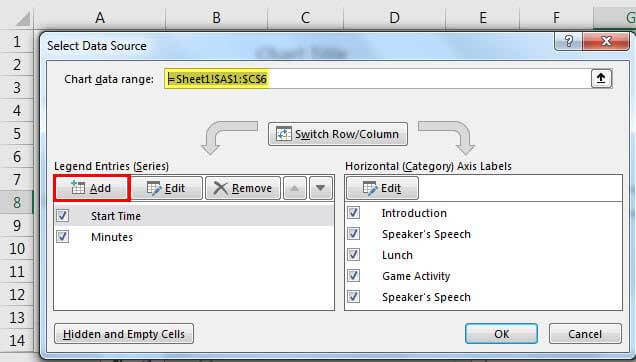
Step 4: For “Series name” select the duration, and for “Series value” choose data from C2:C6.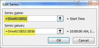
Step 5: In the “EDIT” option, select the “Vertical axis” values. The vertical axis is the task, activity, or project name.
As a result, the chart should look similar to the one below.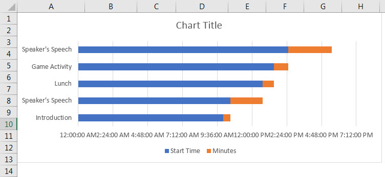
- Step 6: Format the X-axis, as shown in the below picture. In number, formatting makes format in time format, hh:mm:ss

Now, the chart will look like the one below.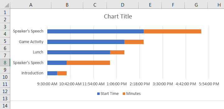
- Step 7: Now, we must select blue bars and format them. Make “Fill” as “No fill”. Remove gridlines, delete legends, add a chart title, etc.

The final chart is ready, and we believe it is just rocking at the movement.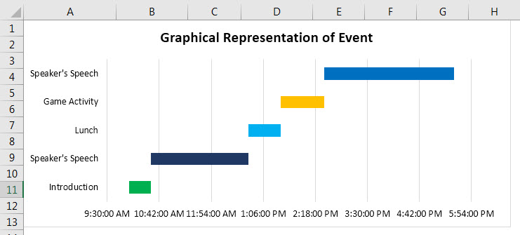
Example #2 - Sales Cycle Tracker
Assume a “Sales Manager” who wants to decide the sales cycle duration for different event and are ready with the below data. The management asks him to present it in a neat and professional graphical presentation. We will see with an example.
The steps in preparing a graphical representation are:
Step 1: Ready with the below data.
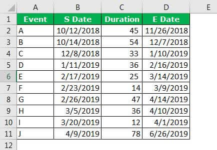
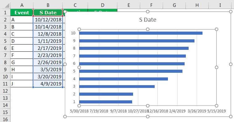
Step 2: First, we must select the “Start Date”, and insert the bar chart.
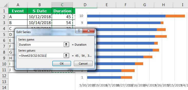
Step 3: Once the chart is inserted, click on the data, and add the data series. The data series we will add is the “Duration” column. Again, please refer to the previous example to know the steps.
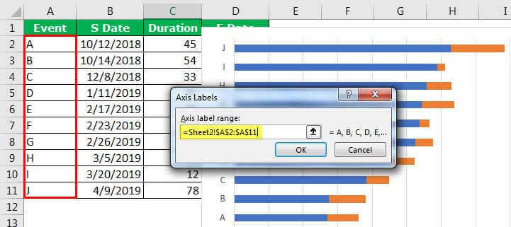
Step 4: As soon as we insert the new item, we need to add vertical axis names.
Once we are done with the chart, the chart will look like this.
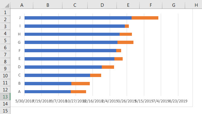
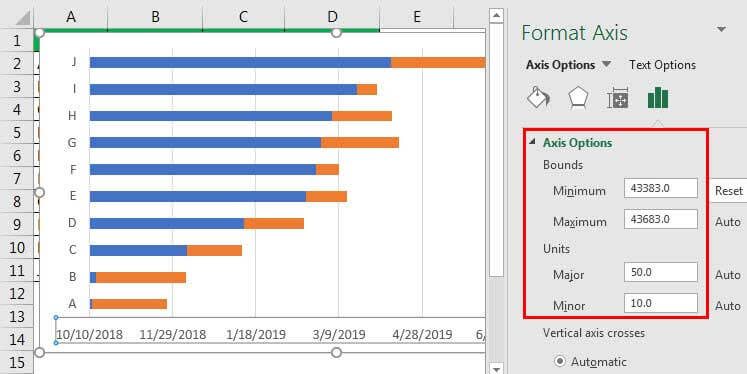
Step 5: Format X-Axis values to arrange the date properly. The below image will give us an idea.
Now, the Gantt Chart may look like this.

Note: We have removed Legends from the chart.
Step 6: Now, select blue bars, the “Start Date” series in the chart, and format it.

Step 7: Design the chart with different colors for different events.
- Apply 3-D formatting. For 3-D formatting, we must go to the “formatting” sections of the chart and explore all the possible options.
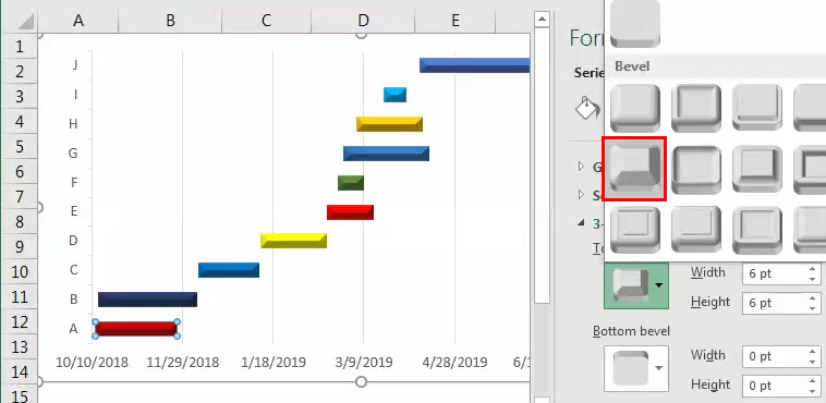
- Apply different colors for different bars to give differentiation.

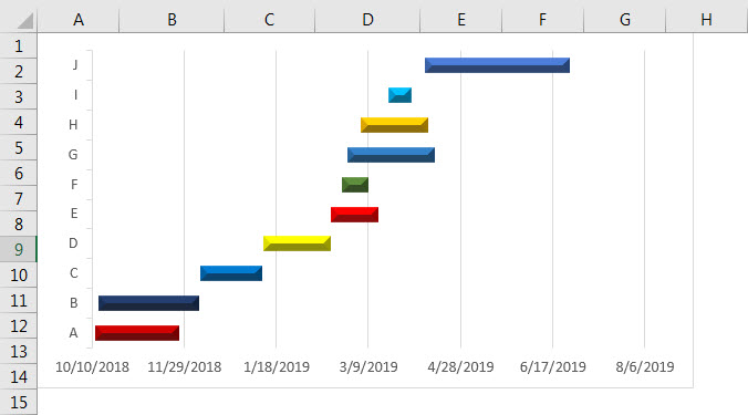
Finally, we are ready to present our presentation to the management.
PRACTICE TIME
Now, we have learned the idea of creating a Gantt Chart. Here, we are giving simple data to present.
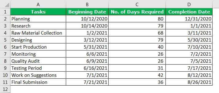
We are required to do the production of mobile phones in an ABC Co.
Therefore, we need to create a schedule of tasks to go to and the job. The below data is what we have, and we present it in a Gantt Chart to track the activities.
Pros And Cons Of Gantt Chart
| Pros of Gantt Chart | Cons of Gantt Chart |
|---|---|
| It can provide complex data in a single picture. By looking at the chart, anybody can understand the current situation of the task or the progress of the chart. Planning is the backbone of any task or activity. Planning must be as realistic as possible. Gantt Chart in Excel is a planning tool that can allow us to visualize a movement. Excel Gantt Charts can communicate the information to the end-user without any difficulty. | For many tasks or activities, the Excel Gantt Chart becomes complex. The size of the bar does not indicate the weight of the job. Regular forecasting is required, which is a time-consuming task. |
Factors To Be Considered
Some of the factors to consider while creating a Gantt Chart in Excel are,
- We must determine the tasks that need to be completed. Also, how long the job will take.
- We must avoid complex data structures.
- We must not include too many X or Y-axis values, making the chart look very long.
Important Things To Note
- In a Gantt Chart, the size of the bar does not indicate the weight of the job.
- Regular forecasting is required, which is a time-consuming task.
