Excel 3D Plot Chart
Before making a 3D plot in Excel, we must first know what a plot is. Plots are charts in Excel that visually represent the given data. There are various types of charts in Excel used to describe the data. But mainly, the data is represented in 2D charts, which means the data or the table is in two series: the X-axis and Y-axis. But what if we have three variables, X, Y, and Z? How do we plot this chart? We will learn about this 3D plot in Excel through this article.
Our problem is that we have data on the three-axis, i.e., X, Y, and Z. How do we plot this data in charts? The chart we use to represent this data is a 3D or surface plot in Excel. 3D plots mean three-dimensional data. Here, there are three variables. One variable is dependent on the other two, while the other two are independent. Two-dimensional charts help represent the data, while three-dimensional data are helpful in data analysis, such as correlation and regression. This chart type is plotted on the X, Y, and Z-axis, where two are horizontal while one is vertical. Which axis is to remain the primary axis? That is entirely up to the chart user. The primary axis can be which data is either independent or one of the two dependents.
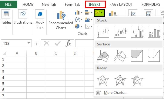
Where can we find a 3D plot or surface chart in Excel? In the “Insert” tab, we can find an option for surface charts under the “Charts” section.
The charts highlighted are surface or 3D plots in Excel.
How to Create a 3D Plot in Excel?
Now, let us make the surface, i.e., 3D plots in Excel with the help of a couple of examples.
Example #1
Follow the below steps:
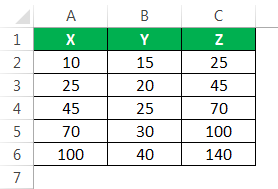
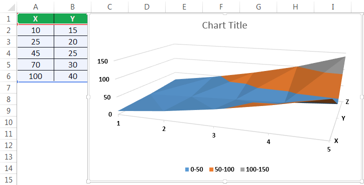
- Let us pick some random data first, like the one below.
We have somerandom numbers generated in Excel- X, Y, and Z columns, and we will plot this data in 3D plots.

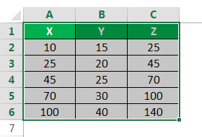
- Select the data we want to plot the 3D chart.

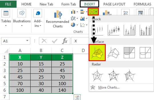
- Click on the surface chart in the “Insert” tab under the “Charts” section.

- Excel’s typical 3D surface plot appears below, but we cannot read much from this chart.

- As we can see, a surface chart works in the colors. Therefore, the ranges are shown in colors.

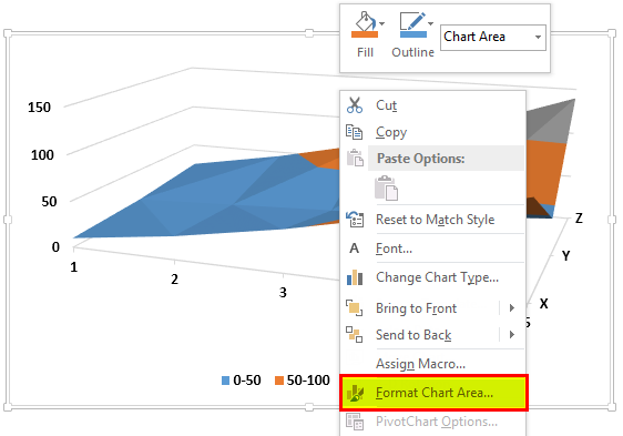
- This chart is not very readable, so right-click on the map and click “Format Chart Area.”

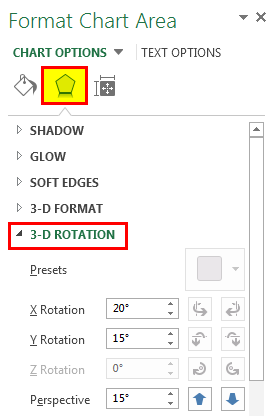
- A chart formatting toolbar will pop up, then click on “Effects.” In “Effects,” click on “3-D Rotation,” as shown below.

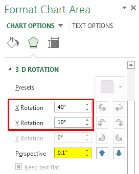
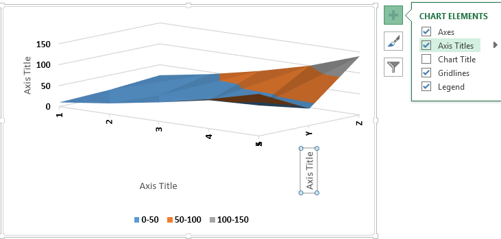
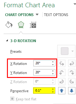
- Change the values for X and Y rotation and the perspective, which will make the chart easier to read.

- The chart will now look as shown below after changing the default rotation.

- Now, we have to name the axis. We can give the axis title by clicking on the button provided by Excel.


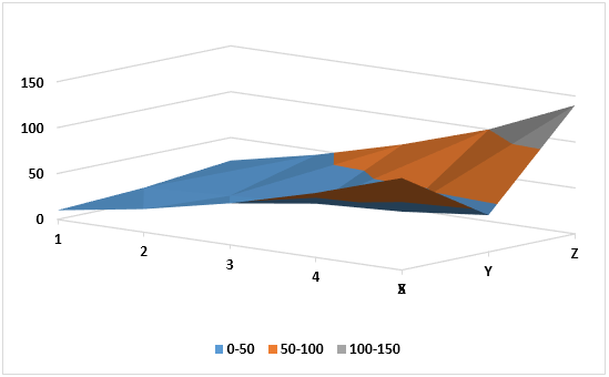
The above surface chart is the 3D plot for the random data selected above. Let us use 3D surface plots in Excel for some tricky situations.
Example #2
Suppose we have data for a region with sales over six months. We want to display this data in a chart. Let us have a look at the data below.
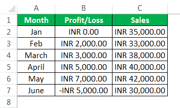
We want to show this in the 3D chart as we have three variables to define. One is the month. Another is the company’s profit or loss, and the third is the total sales made that month. Follow the following steps: –
- Select the data in which we want to plot the 3D chart.
- Click on the surface chart in the “Insert” tab under the “Charts” section.

- The 3D chart currently looks like the one below.
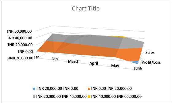
- The colors indicate value ranges in the chart. For example, it ranges from -20,000 to 60,000, but our data on the profit/loss is only between 7,000 to -5,000 and 30,000 to 40,000, so we need to change it. Press the right-click on the chart and click on the “Format Chart Area.”

- A chart formatting toolbar appears. Now, click on “Effects.” At the bottom of the effects, click on the option uncheck from “Autoscale.”
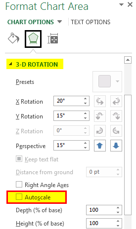
- The checks option of the chart toolbar in Excel changes the perspective to the point at which we can view the chart correctly.
- Our chart currently looks like the one below.

- There are various other formatting options in the “Design” tab, such as adding a chart element.
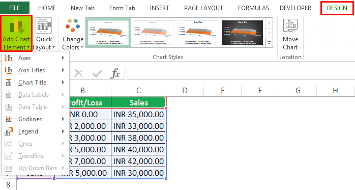
Add a title to the Chart as “Sales Data.”
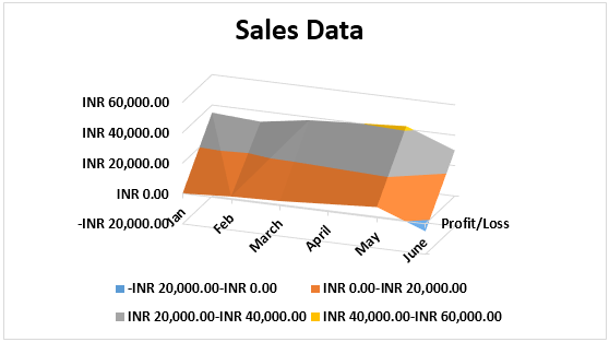
Why do we use 3D plots in Excel? To answer this question, we can refer to example two. First, the data was in three series, i.e., we had to represent the data on the three-axis.
It was impossible with 2D charts as two-dimensional charts can only represent the data on a two-axis. The 3D surface plots in Excel work in color coding. The color represents the ranges of the data in which they are defined.
For example, look at the screenshot below from example 2:
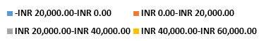
A different set of colors represents every range of values.
Things to Remember
- The 3D surface plots in Excel are helpful but are very difficult to use, so they are not used very often.
- Out of the three-axis in a 3D plot, one is vertical, while the other two axes are horizontal.
- In the Excel 3D surface plot, the 3D rotation needs to be adjusted per the range of data, as it can be challenging to read from the chart if the perspective is incorrect.
- We should name the axis to avoid confusion on the X, Y, or Z-axis for the user.
Recommended Articles
This article is a guide to 3D Plot in Excel. We discuss how to create 3D surface plot (Chart) in Excel with examples and a downloadable Excel template. You may learn more about Excel from the following articles: –