How to Create a Pareto Chart in Excel? (Step by Step)
Below are the steps to create a Pareto chart in Excel.
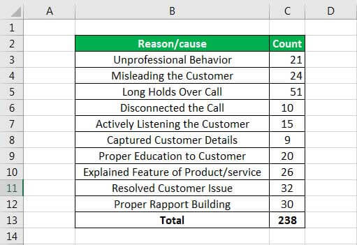
- Collect the raw data, including the category (cause of a problem) and their count.
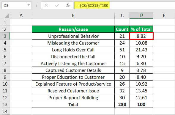
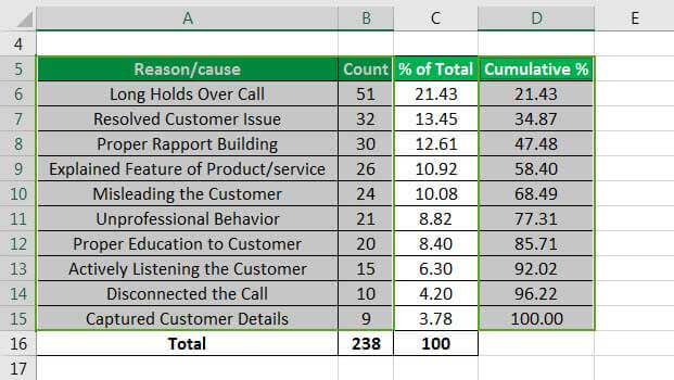
- Calculate the percentage of each category and further compute the cumulative percent.
The percent can be calculated using the formula =(C3/$C$13) *100, applied throughout the other cells.Cumulative PercentageIt is the method of calculating the frequency distribution and will be calculated successively by adding the percent with other frequencies. So, the formula will be =D6+C7. After sorting the values from largest to smallest, we calculate the cumulative percentage for each category.

- Select a category, count, and cumulative percent range, as shown below.
Go to the “Insert” tab in Excel and select a “2-D Column” bar graph.Now, the Pareto chart created is shown below:

- Select the cumulative percent bars and change the series chart type to “Line.”
The red bars are the cumulative percentage bars, select any of the bars, change the series, and select “Line” from the “Change Chart Type.”Now, the Pareto chart will look like the one shown below.

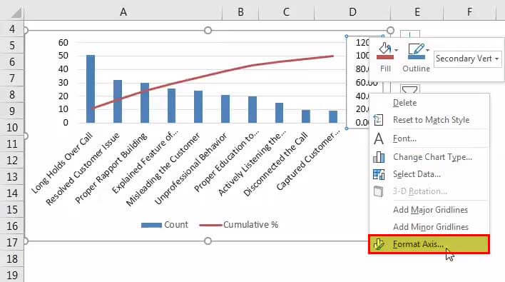
- Right-click the cumulative total line (in red) and choose “Format Data Series.”
Select thesecondary axis in excelAfter selecting the “Secondary Axis,” close the “Format Data Series” window.Now, the Pareto chart will look like as shown below.

- Click on the right-hand axis and select the “Format Axis.”
Then, under the “Axis” option tab, select “Maximum” to set it to be fixed and set the value to 100.In the “Axis” options, select the “Maximum” from “Auto” to “Fixed.” Then, enter a value of 100 manually and close the “Format Axis” window.Finally, the Pareto chart will look like the one shown below.


The chart above shows that 80% of the effects come from 20% of the causes.
Advantages
- The Pareto chart highlights the major cause of the problem that hampers a process.
- It helps to rectify the major issues and thus increases organizational efficiency. Furthermore, once the big hitters in a process are discovered using this technique, one can move ahead with the resolutions, thus increasing the organization’s efficiency.
- It also enhances problem-solving skills as it enables you to sort out business-related issues into strong facts. Then, once we have vividly laid out these facts, we can start the important planning to take care of the issues.
- It improves decision-making in a process.
It helps the corporate team focus on the input that will have a greater impact per the 80/20 rule.
Limitations
- The Pareto chart does not provide insight into the problem’s root cause.
- A single cause or a reason category may have other factors involved, so to find the major impact at each level of the problem, we have to create many Pareto charts. So, lower levels of the Pareto chart are often required.
- The Pareto chart is based on the frequency distribution. Hence, we cannot use it to calculate the mean, standard deviation, and other statistical values that may often require.
- We cannot utilize the Pareto chart to compute how awful the issue is or how far changes would bring a procedure back into specification.
Things to Remember
- Before creating a Pareto chart, it is necessary to categorize the issues. It is considered a good practice to keep the categories less than 10 in number.
- It is based on past data. So, to continuously improve a process, it is necessary to revamp the data periodically since the Pareto analysis is based on the historic data and does not provide a forecast analysis.
- We must always create the secondary Y-axis with percentages descending from 10 to 100.
- It helps provide an easier way to distinguish before and after Pareto analysis to verify the process changes had the desired outcome.
- We can create multilevel Pareto charts for each issue and can further perform another Pareto analysis on the sub-level issues and so on.
Recommended Articles
This article is a guide to Pareto Chart in Excel. We discuss its uses and how to make a Pareto chart in Excel, along with Excel examples and downloadable Excel templates. You may also look at these useful functions in Excel: –