
Table Of Contents
What Is Heat Map In Excel?
A heat map in Excel is a type of map created to show data representation in different colors. The colors indicate which area of the data needs to be focused on and which can be ignored. The intensity of the colors shows the impact of the data series over the whole data set. The color scale in this type of chart varies from green to yellow to red. The green color has been given the most importance, whereas red has the least significance.
For example, consider the below table showing name and age of a population. Now, let us learn how to create a heat map in Excel.

To start with, select the data and click on Home - Conditional Formatting - Color Scales - Green - Yellow Color Scale.
We can see the data showing the color scale.

Likewise, we can create heat map in Excel.
Key Takeaways
- Heat maps in Excel use colors to represent data, highlighting important areas and downplaying less significant ones.
- The colors indicate the impact of the data series on the dataset, with green showing the most significant and yellow/red indicating the least important.
- This allows users to identify the importance of each data point quickly.
- The heat map in Excel is a data visualization technique that represents data in a comparative view.
- Heat maps visualize data using color to indicate high and low values. Color-coded cell ranges through conditional formatting identify patterns in large datasets.
Explained
Excel heat map is a representation type that helps us compare the huge data as per the specifications. The heat map in Excel is also called a data visualization technique. In technical terms, the heat map is a visual representation of data, representing the comparative view of data.
- The heat map is compared to the data on a color scale, which varies from green to yellow to red. In this scale, the green color represents the high value, yellow represents the moderate value, and red represents the low value.
- In short, the heat map is a visual representation of data with the help of colors per the values.
- In this type of heat map, we do presentations based on colors, which range from yellow to orange to red, and so on. We can choose some specific colors based on our choices.
How To Create A Heat Map In Excel? (Step-By-Step)
We can create a simple Excel heat map conditional formatting in excel. Here are a few steps to create a heat map of a data pool.
Below are steps to create a heat map in Excel:
- First, we must select the column of the data on which we want to apply the heat map.
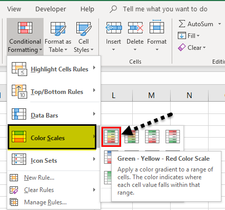
- Now, go to the "Home" tab, go to "Styles," click on "Conditional Formatting," and get a list. Now, we have six different color combinations of color scales available. We can select anyone to create a heat map in Excel.
- After selecting "Conditional Formatting," click on "Color Scales" from the list.
- Now, we have six different color combinations of the color scale, and you can select anyone to create a heat map in Excel.
Examples
Example #1
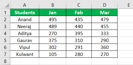
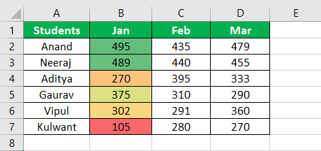
We have data from the student's marks for three months of sessional exams. In this data, we need to compare the performance of students.
- Step #1 - The data of marks of the student for three months is shown below:
- Step #2 - First, we must select the column we want to create a heat map.
- Step #3 - Now, go to the "Home" tab, go to "Styles," and click on "Conditional Formatting." Then, we will get a list of options.
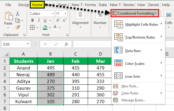
- Step #4 - Now, click on "Color Scales" from the list.
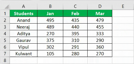
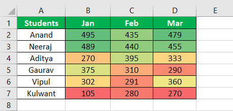
- Step #5 - Now, we have six different color combinations of the color scale, and we can select anyone to create a heat map. See the figure below for the type of color combination.
- Step #6 - Follow the same for the rest of the column and see the result below:
Now, let us learn with some more examples.
Example #2
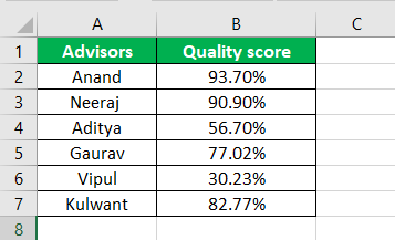
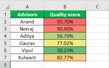
We have data on the quality score of advisors for a month of performance in sales. Therefore, we need to compare advisors' performance for the given month in this data.
- Step #1 - The data of quality score for three months is shown below:
- Step #2 - Now, we must select the column we want to create a heat map.
- Step #3 - Next, go to the "Home" tab, then go to "Styles" and click on "Conditional Formatting," and then we may get a list of options.
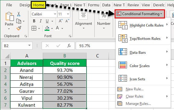
- Step #4 - Now, click on "Color Scales" from the list.
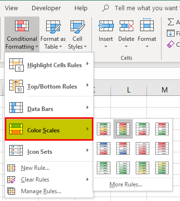
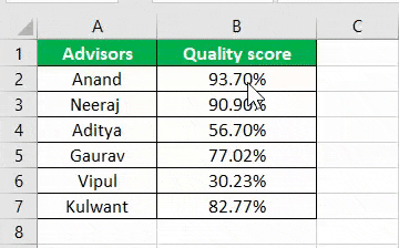
- Step #5 - Now, we have six different color combinations of the color scale, and we can select anyone to create a heat map. See the figure below for the type of color combination.
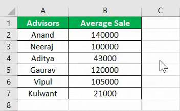
Example #3
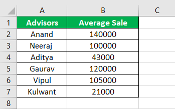
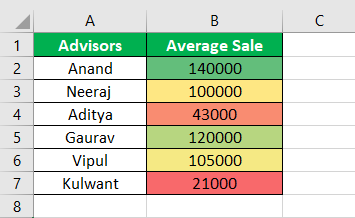
We have data on the average sale of advisors for a month's performance in sales. In this data, compare the performance of advisors for the given month.
- Step #1 - The data of quality score for three months is shown below:
- Step #2 - Now, select the column we want to create a heat map.
- Step #3 - Next, go to the "Home" tab, then go to "Styles" and click on "Conditional Formatting," then we may get a list of options.
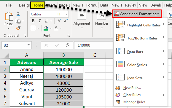
- Step #4 - Now, click on "Color Scales" from the list.
- Step #5 - We have six different color combinations of the color scale, and we can select anyone to create a heat map. See the figure below for the type of color combination.
Important Things To Note
- A heat map visual representation of data that bifurcates data by colors ranging from high to low.
- The user can choose colors.
- A heat map is conditional formatting performed on data. For example, the data that applies to a certain color has a certain cell range color used.
