What are Dynamic Charts in Excel?
A dynamic chart is a special chart in Excel which updates itself when the range of the chart is updated. In static charts, the chart does not change itself when the range is updated.
To create a dynamic chart in Excel, the range or the source of data needs to be dynamic in nature. A dynamic chart range can be created in the following two ways:
- Use name ranges and the OFFSET function
- Use Excel tables
Let us explain both the methods with an example.
#1 – How to Create a Dynamic Chart in Excel Using Name Range?
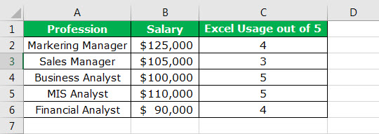
The following table shows the professions that require a working knowledge of Excel. For every profession, the expected salary and the usage of Excel on a scale of 5 are listed.
We have inserted a simple column chart using the Insert feature of Excel.
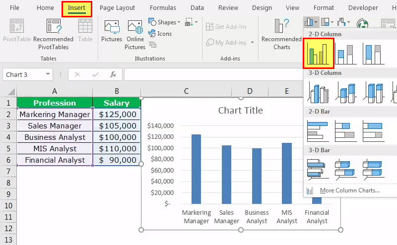
In case there are additions to the column of professions, the chart will not incorporate the range automatically. To prove this, let us add two new professions, “logistician” and “accountant” along with their respective salaries.
The chart is still taking the range A2:A6, as shown in the following image.

To make the range dynamic, we need to give a name to the range of cells. The following steps will help create a dynamic chart range:
- In the Formulas tab, select “Name Manager.”

- After clicking on “Name Manager” in Excel, apply the formula shown in the succeeding image. A dynamic chart range for the salary column is created.
Note:While creating a name range, there should not be any blank values. This is because, in the presence of blank cells, the OFFSET function will not do accurate calculations.

- Click on “Name Manager” again and apply the formula shown in the following image. A dynamic chart range for the profession column is created.
With this, we have created two dynamic chart ranges–“Salary_Range” and “Profession_Range.”
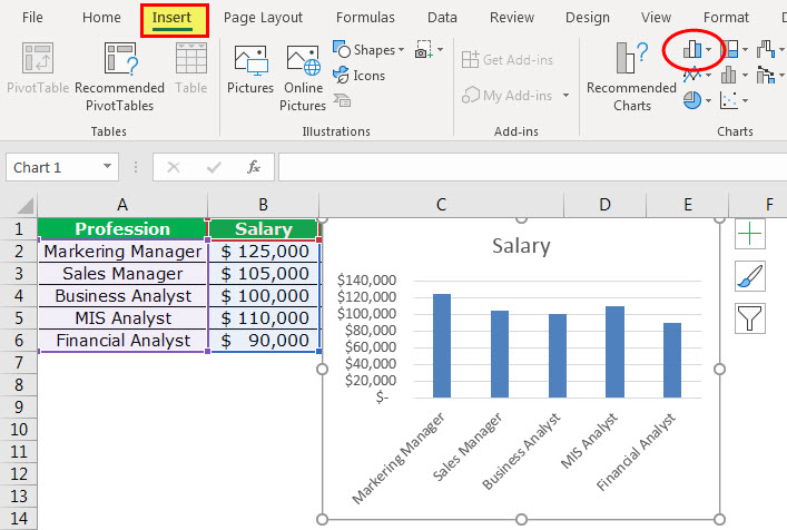
- Now, we insert a column chart using the named ranges. In the Insert tab, select column chart.

- Select a 2D clustered column chart from the various column charts in excel. Presently, it will insert a blank chart.

- Right-click on the blank chart area and click “Select Data.”

- A box opens, as shown in the following image. Click the Add button.

- On clicking the Add button, you will be asked to select the “series name” and “series values.”

- In “series name,” select the entire salary column. In “series values,” mention the name range created for the salary column, i.e., “Salary_Range.”
Note:The name range needs to be mentioned along with the sheet name, i.e., “=‘Chart Sheet’!Salary_Range.” Always place the sheet name within single quotes followed by an exclamation mark like =‘Chart Sheet’!.

- Click the “Ok” button to open the following box. Then click on the Edit option.
- On clicking the “Edit” option, a box shown in the succeeding image opens. The “axis label range” is to be filled in.

- In “axis label range,” we need to mention the second name range we had created.
Note:The name range needs to be mentioned along with the sheet name, i.e., “=‘Chart Sheet’!Profession_Range.”
- Click the “Ok” button to open one more box. Click the “Ok” button in the next box again.
The chart appears as shown in the following image.

- Add the two new professions, “logistician” and “accountant” along with their respective salaries. The chart updates automatically.


An update in the source data updates the dynamic range instantly. It is followed by an update in the Excel chart.
#2 – How to Create a Dynamic Chart Using Excel Tables?
It is easy to create a dynamic chart using an Excel table. This is because as soon as new data is added, the table expands to incorporate this data.
Let us work with the same data that we used under the previous heading. The steps to create a dynamic chart using excel tables are listed as follows:
- Step 1: Select the source data and press CTRL+T. A table is created.
- Step 2: Once the table is created, select the data from A1:B6. In the Insert tab, click on the column chart. A chart appears as shown in the following image.
- Step 3: Add the two new professions (“Logistician” and “Accountant”) and their respective salaries to the list. The chart updates automatically.

Frequently Asked Questions (FAQs)
What is the difference between static and dynamic charts in Excel?
The differences between a static chart and a dynamic chart are listed as follows:
– A static chart does not change in appearance throughout its usage, while a dynamic chart reacts to the actions performed by the user.
– The display of a static chart remains the same irrespective of a change in its source of data. On the other hand, the display of a dynamic chart changes with an expansion or contraction of data.
– Static charts are used in reports and are created for documentation purposes. In contrast, dynamic charts are used in businesses where there is a need to evolve the chart elements in response to the changing business conditions.
– A static chart is a snapshot of the existing data and is non-interactive in nature. In contrast, a dynamic chart is data-aware, implying that it is connected with the changes in business data.
How to title a dynamic chart in Excel?
The steps to title a dynamic chart in Excel are as follows:
1- Click on the existing title of the dynamic chart.
2 – In the Formula bar, type the “equal to” sign.
Click on the cell containing the text that you want to be the title of the chart.
3 – In the Formula bar, the worksheet name followed by the cell address that you have linked appears.
4 – Click the Enter button and the title of the chart is ready.
With a change in the content of the cell that has been linked, the chart title automatically updates.
How to add an axis title to a dynamic chart in Excel?
The steps to add an axis title to a dynamic chart in Excel are as follows:
1 – Select the chart and in the Design tab, go to Chart Layouts.
2 – Open the drop-down menu under “Add Chart Element.” In the earlier versions of Excel, go to “labels” in the Layout tab and click on “axis title.”
3 – From the “axis titles” option, select the desired position of the axis. You can choose the position of both axes, horizontal and vertical, from “primary horizontal” and “primary vertical” respectively.
4 – Type the text of the axis title in the axis title text box.
Note: If you change the chart layout to one that does not support axis titles, these titles would no longer appear on the dynamic chart.
- A dynamic chart in Excel updates itself with an update in the range of the chart.
- To create a dynamic chart range, use either the OFFSET formula or the Excel table.
- An OFFSET formula does not work accurately in the presence of blank cells.
- A sheet name should always be placed within single quotes followed by an exclamation mark.
- It is easy to create a dynamic chart with the help of Excel tables as the table expands with the addition of data.
- While giving a reference in chart data, first type the name and then press F3; the entire defined name list opens.
Recommended Articles
This has been a guide to Dynamic Chart in Excel. Here we discuss the two ways to create a dynamic chart in excel using name range and Excel tables, along with examples and downloadable excel templates. You may also look at these useful functions in excel –