What Is An Organization Chart In Excel?
Organization charts in Excel are used to represent the organizational structure of any business or company. It is used to describe the reporting or the hierarchy for every employee associated with the organization. We need to use this chart’s pre-defined SmartArt templates in Excel.
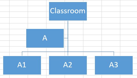
Consider the below hierarchy showing Classroom – A – A1 – A2 – A3. Now, let us learn how to create organization chart in Excel.
Step 1: First, click on Insert – SmartArt – Hierarchy – Organization Chart.
Step 2: Next, click on the desired chart style.
Step 3: Then, enter the text.
Likewise, we can create organization chart in Excel.
Key Takeaways
- Organization chart in Excel shows the roles and hierarchies in a given organization.
- In Excel, we can create four variants of the organization chart: Organization Chart (Regular) Picture Organization Chart Name and Title Organization Chart Half Circle Organization Chart
- We can apply formatting to an organization chart regarding colors and styles.
- Remember, Design – Change Colors allows us to change the colors of the chart.
- Similarly, Design – SmartArt Styles enable us to change the styles in Excel.
How To Create An Organization Chart In Excel?
Let us start.
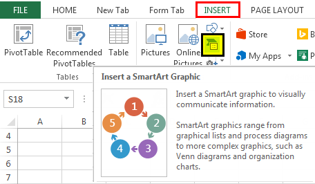
- Click on the Excel worksheet where we want to add the organization chart and go to the “INSERT” tab – SmartArt.

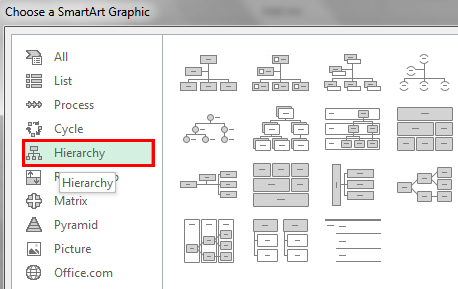
- Clicking on it would open a new window, as shown in the above figure. Next, click on the 5th option from the left side panel named “Hierarchy.”

- Observe that the options in the right-hand panel will change accordingly. Select the 1st option in the 1st row, “Organization Chart,” as given below.

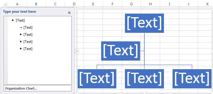
- Clicking on “OK” would close the dialog box and insert an organization chart layout in the active worksheet, as shown in the figure below.

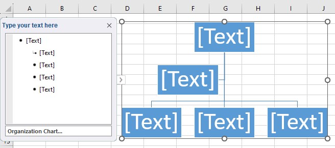
- As we can see in the above picture, the organization chart consists of two panes: a text pane on the left and a SmartArt graphics pane on the right.
The text pane is a well-aligned bullet list of the data that acts as an input to the SmartArt graphics. For example, we can type the desired text inside[Text]. [Text]is a placeholder text, meaning we would replace it as we go on inserting the actual text. Whatever we type in the left pane automatically gets reflected in the right-side SmartArt graphics.
- At the bottom of the left-side text pane, we see the description of the SmartArt graphic and the organization chart in this case.
The SmartArt graphic is mapped to the left-side pane based on the alignment of the bullets and sub-bullets. So, it consumes the text values entered in the left-side pane and automatically updates the graphical representation denoting the same.


Example
Example #1
Consider the below table showing the academic plan as shown below. Now, let us learn how to create the organization chart in Excel.
Year 1
|
Semester 1
| Unit Test 1
| Unit Test 2
| Unit Test 3
Step 1:
- As studied before, we must follow this path to insert an organization chart in the Excel worksheet.
Insert – SmartArt – Hierarchy – Organization Chart.
- We must insert a default organization chart Excel template in the worksheet.
Step 2:
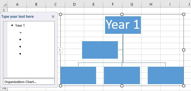
- Click on the first [Text] and enter the top-most role in the problem statement, Year 1.
- We will see that the graphic also gets changed accordingly.
- Now, the organization chart has the top-most role as Year 1.
Step 3:
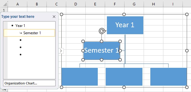
- The next in the hierarchy is Semester 1. There is only one Semester under Year 1.
- The 2nd bullet is a sub-bullet. So, we must enter “Semester 1“ in the 2nd text box.
- Now, there is Semester 1 under Year 1.
Step 4:
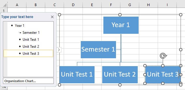
- Now, there are three tests: Unit Test 1, Unit Test 2 and, Unit Test 3 under Semester 1.
Likewise, we can use organization charts in Excel.
Example2
Create An Organization Chart To Show A Given Organization Hierarchy
Vice President
|
Director
|
Manager
| Engineer 1
| Engineer 2
Step 1:
- As studied before, we must follow this path to insert an organization chart in the Excel worksheet.
Insert – SmartArt – Hierarchy – Organization Chart.
- We must insert a default organization chart Excel template in the worksheet.
Step 2:
- Click on the first [Text] and enter the top-most role in the problem statement, Vice President.
- We see that the graphic also changed accordingly.
- Now, the organization chart has the top-most role as Vice President.

Step 3:
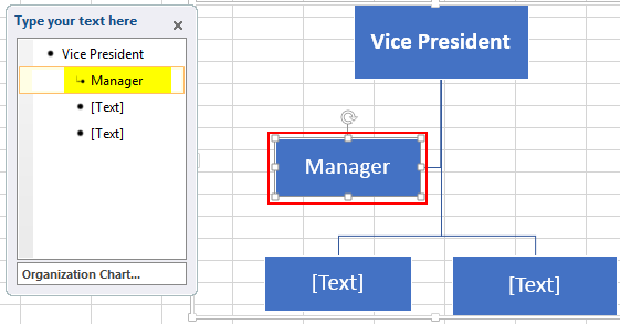
- The next role in the hierarchy is Manager. There is only one manager under the Vice President.
- The 2nd bullet is a sub-bullet. So, we must enter “Manager“ in the 2nd text box.
- Now, there is the role of Manager under the Vice President.
Step 4:
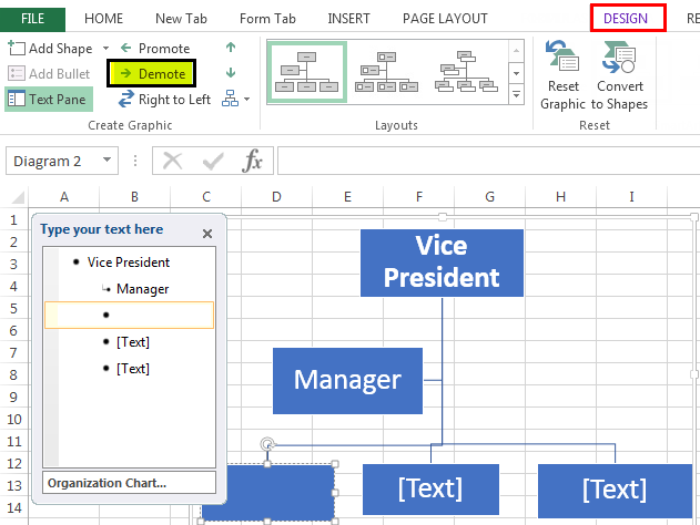
- Now, there are two employees: Engineer 1 and Engineer 2, under the Manager.
- So, click on “Demote” under the “Design” tab and create a new sub-bullet under “Manager.”
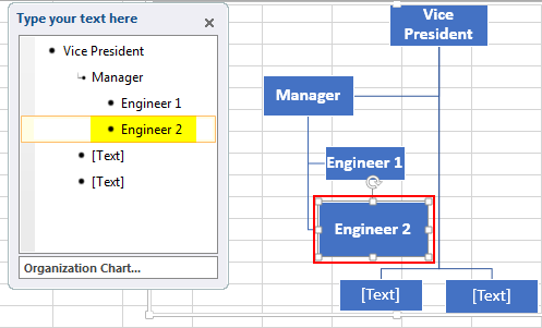
- Insert text ‘Engineer 1 ‘in the text box.

Step 5:
- There is another employee named “Engineer 2″ under the same Manager.
- So, we must press the “Enter” key after Employee 1, which will create another sub-bullet under “Manager.”
- Then, insert the text “Engineer 2” in the text box.
Step 6:
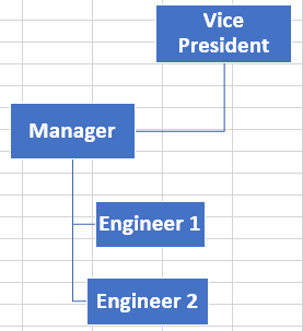
- As we have achieved the organization chart representation of the given hierarchy, we can delete the remaining [Text] placeholders from the template.
- Click on each unwanted [Text] placeholder and press the “Delete” key on the keyboard.
- The resultant organization chart in Excel is shown below.
Important Things To Note
- Organization chart in Excel represents the hierarchy in Excel.
- The types of charts are
- Organization Chart (Regular)
- Picture Organization Chart
- Name and Title Organization Chart
- Half Circle Organization Chart
Frequently Asked Questions (FAQs)
Explain how to use organization chart in excel with an example.
Consider the below hierarchy showing Category – Sections – A – B – C. Now, let us learn how to create organization chart in Excel.
Step 1: First, click on Insert – SmartArt – Hierarchy – Organization Chart.

Step 2: Next, click on the desired chart style.
Step 3: Then, enter the text.
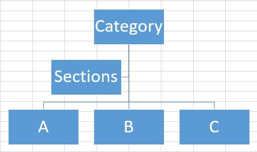
Likewise, we can create organization chart in Excel.
Can we add sub-sections in the chart?
Yes. We can add sub-sections in the chart. Simply, click on Demote under the Design tab and create a new sub-section.
Recommended Articles
This article is a guide to Organization Chart in Excel. We discuss creating an organization chart in Excel with some examples and a downloadable Excel template. You may also learn more about Excel from the following articles: –