Part of our Excel Charts guide
Excel Standard Deviation Graph / Chart
The standard deviation is one of the important statistical tools which shows how the data is spread out. For example, in the stock market, how the stock price is volatile.
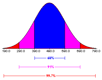
Typically, the standard deviation is the variation on either side of the average or means value of the data series values. We can plot the standard deviation in the Excel graph called the “bell-shaped curve.”
The bell curve is the graph commonly used to gauge the performance appraisal of company employees. All the organizations work on performance appraisal for a specific period frame. Using this performance appraisal, they reward employees in terms of salary, promotions, etc.
They gauge employees on low or non-performers, average performers, and high performers. Plating a bell-shaped graph shows the highest probability of the outcome, and the likelihood of the outcome keeps going down when the bell shapes move to either side from the center point.
For example, look at the below Excel bell shaped curve graph.
Assume you are working in a team of 50 members, and your rating is very similar to the other team members. Then, only a few employees get a higher rating, a majority will get an average rating, and a few will get a low rating. For example, if you got 8 as a rating and your team member got 7 as the rating, there would not be much difference here.
The bell-shaped curve is the best fit to gauge the employee, rate them, and then reward them accordingly to make the comparison fair.
All the higher-rating employees in the bell curve will be placed on the right-hand side of the bell curve, low-rating employees will be placed on the left-hand side of the bell curve, and average employees will be placed in the center of the bell curve.
We need two calculations to understand the Excel Standard Deviation graph or bell-shaped curve. One is the MEAN or AVERAGE of the data series, and the second is the standard deviation (SD), which shows how to spread the data series.
For example, if the average score of the students in the class is 70 and SD is 5, then students scored within either side of the mean value, i.e., 70. The first range will be 65-70, and the second range will be 70-75.
How to Create a Standard Deviation Graph (Chart) in Excel?
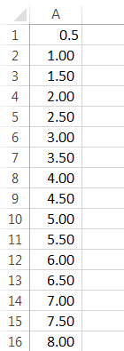
To better understand Excel’s standard deviation graph (chart), let us consider our real-life example of a student’s marks in an examination.
We have taken 25 students’ sample data, and below are the scores of these 25 students in an examination.
The first thing we need to do is calculate the AVERAGE score of the examination. Apply the Average Formula.
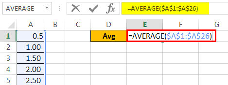
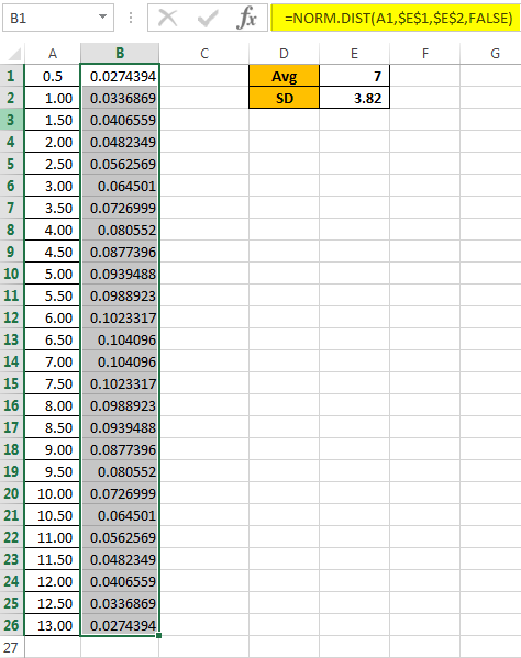
We got the result of 7.

Secondly, calculate the standard deviation of the data series.
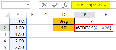
The result is shown below:
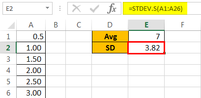
Note: Since we had taken sample data, we have used STDEV.S, which is used for the sample data series.
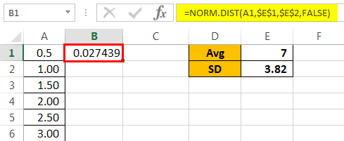
In the B1 cell, enter the normal distribution excel formula, i.e., NORM.DIST.
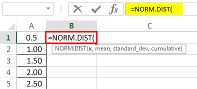
x is nothing but our data point, so select A1 cell.
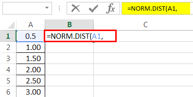
MEAN is the average value we have calculated, so give a link to cell E1 and make it an absolute reference.
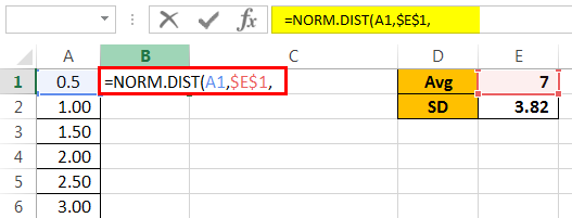
Next is SD to give a link to cell E2 and make it an absolute excel reference.

The next thing is cumulative. Select “FALSE” as the argument.

Now, see the result.
Drag the formula to other cells to have normal distribution values.
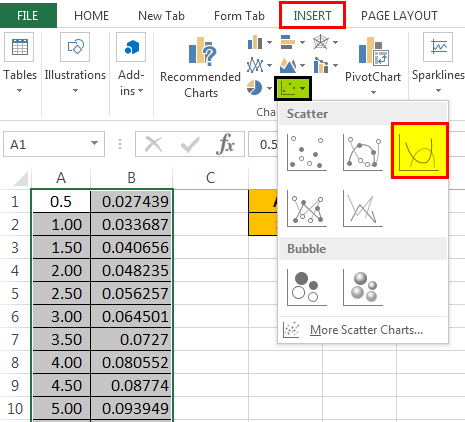
Create a standard deviation Excel graph using the below steps:
Select the data and go to the “INSERT” tab. Then, under “Charts,” select “Scatter” chart, and prefer a “Scatter with Smooth Lines” chart.

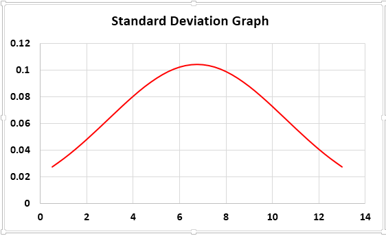
Now, we will have a chart like this.

If needed, you can change the chart axis and title.

Conclusion: Our SD is 3.82, slightly higher, so our bell curve is wider. If the SD is small, we will get a slim bell curve.

Standard Deviation Graph in Excel – Explained in Video

Things to Remember About Standard Deviation Graph in Excel
- The MEAN, or AVG values, are always the center point of the Excel standard deviation graph.
- It will fit approximately 68.2% of the data series in the range, i.e., MEAN – SD to MEAN + SD. (65-70)
- Approximately 95.5% of the data series will be fitted in the range i.e. 2 * (MEAN –SD) + 2 * (MEAN + SD).
- Approximately 99.7% of the data series will be fitted in the range i.e. 3 * (MEAN –SD) + 3 * (MEAN + SD).
- Excel standard deviation graph shape depends on the SD value. The higher the SD value wides the bell curve, the smaller the SD value, and the slimmer the bell curve.
- The statistical person can best explain complete knowledge of the bell curve, and we are limited to the Excel sheet.
Recommended Articles
This article is a guide to the Standard Deviation Graph in Excel. Here, we discuss creating a standard deviation chart/graph in Excel, practical examples, and a downloadable Excel template. You may learn more about excel from the following articles: –