How to Create a Thermometer Chart in Excel?
Excel thermometer chart is the visualization effect used to show the “achieved percentage vs. targeted percentage.“ We can use this chart to show employee performance, quarterly revenue target vs. actual percentage, etc. Using this chart, we can also create a beautiful dashboard.
Follow the below steps to create a thermometer chart in Excel.
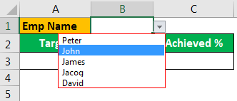
Create a dropdown list in Excel of employee names
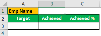
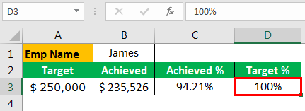
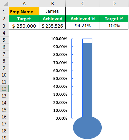
Create a table like the below one.

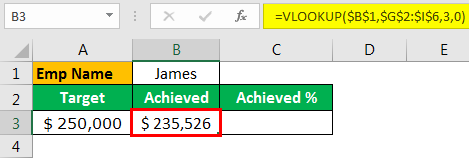
Apply the VLOOKUP function for a dropdown cell to fetch the target and achieved values from the table as we select the names from the dropdown list.

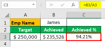
Now, arrive at “Achieved %” by dividing the “Achieved” numbers by “Target” numbers.

Next, to the “Achieved” column, insert one more column (helper column) as “Target” and enter the target value as “100%.

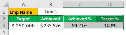
Select “Achieved %” and “Target %” cells.

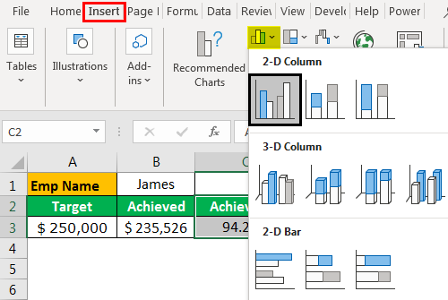
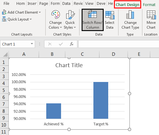
For selected data, let us insert a column chart in Excel. Go to the “INSERT” tab, and insert a 2-D column chart.

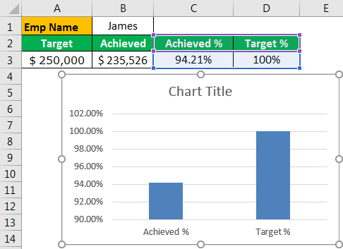
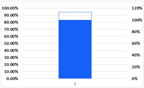
Now, we will have a chart like the below one.

Select the chart, go to the “Design” tab, and click on the option “Switch Row/Column.”

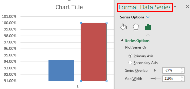
Select the larger bar and press “Ctrl + 1” to open the “Format Data Series” option.

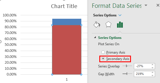
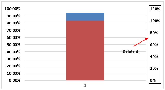
The first formatting we need to make the larger bar “Secondary Axis.”

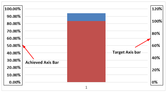
Now, in the chart, we can see two vertical axis bars. One is for the target, and another one is for achievement.

We need to delete the “Target Axis Bar.”
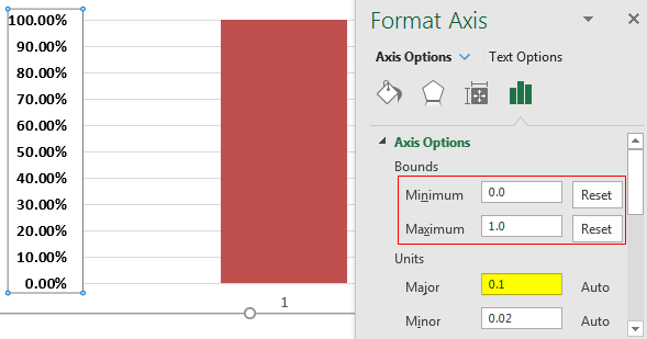
Select the “Achieved %” axis bar and press “Ctrl + 1” to open the “Format Data Series” window.
Click on “Axis Options”>> Set the Minimum to 0, Maximum to 1, and Major to 0.1. Our chart can hold a maximum of 100% value and a minimum of 0%. Major interval points are 10% each.

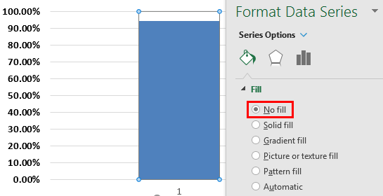
Our chart can hold a maximum of 100% value and a minimum of 0%. Major interval points are 10% each.Now, we can see the only red-colored bar, select the bar, and make the “Fill” as “No Fill.”

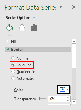
Make the border the same color as shown above for the same bar, which is blue.

Now, you can see the border.

Make the chart width as short as possible.

Remove Excel gridlines from the chart.

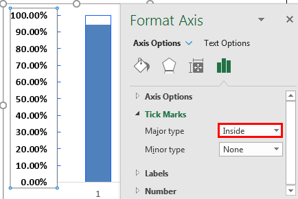
Again, select the vertical axis bar and make the “Major type” tick marks “Inside.”

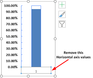
Remove the horizontal axis label as well.

Select the chart and outline “No Outline.”

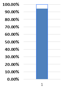
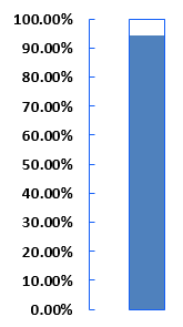
Now, our chart looks like this now.

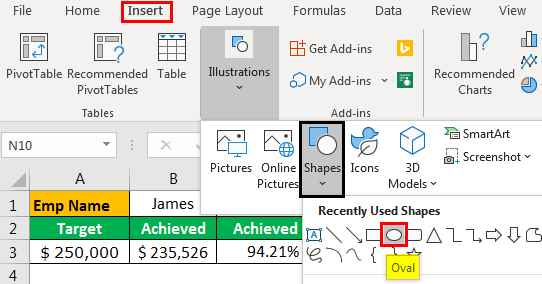
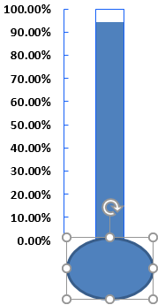
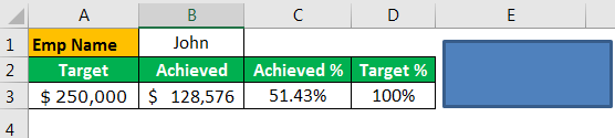
We are almost done. The only thing left is we need to add a base for this Excel thermometer chart.Go to the “Insert” tab from “Shapes” and choose the “Oval” shaped circle.

Draw the Oval shape below the chart.

For the newly inserted oval shape, fill color like the chart bar with no outline.

You need to adjust the oval shape to fit the chart and make it look like a thermometer chart.
Move the shape and change the width and top size to fit the chart’s base.

Select both chart and shape, and group them.

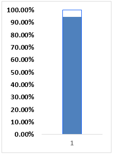
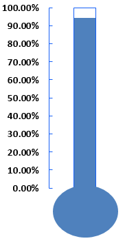
We are done with charting, and it looks like a beauty now.
From the dropdown list, as you can change, the numbers chart also will change, respectively.
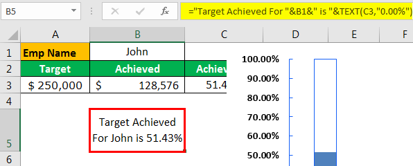
Insert Custom Heading For the Chart
One last thing we need to do is to insert a custom heading for the chart. The custom heading should be based on the employee selection from the dropdown list.
For this, create a formula like the one below in any one of the cells.
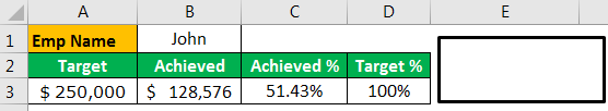
Now, insert a rectangular shape from the “Insert” tab.
Fill the color with “No color” and change the border to “black” color.
Select the rectangular shape, click on the formula bar, and give a link to the formula, B8 cell.
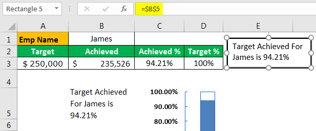
Now, we can see the heading text on top of the chart.
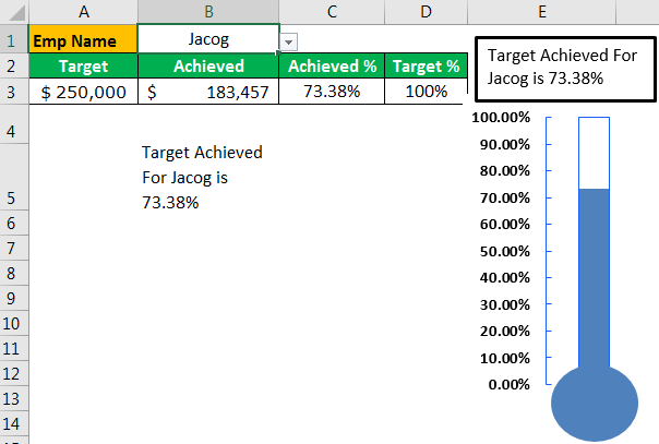
So, now the heading is also dynamic and keeps updating the values per the changes made in the dropdown list.
Things to Remember
- Drawing the shape under the base of the chart is key.
- We must adjust the oval-shaped circle to fit the chart and make it look like a thermometer chart.
- Once the oval-shaped circle is adjusted, always group the shape and chart.
- The border of “Target %,” “Bar of Achieved %,” and the thermometer chart’s base should be the same color and not contain any other colors.
Recommended Articles
This article is a guide to the Thermometer Chart in Excel. Here, we will learn how to create a dashboard using a thermometer chart in Excel, examples, and a downloadable template. You may learn more about Excel from the following articles: –