Conditional Formatting in Power BI
If you think Power BI is limited to visualization and charts, you will spend considerable time figuring out how the below colors or in cell bars have been applied. It is not a bar chart or another visualization. Rather, it is conditional formatting applied to the table visually. Let us tell you that we have spent considerable time figuring this out. This article will explain in detail the conditional formatting in Power BI.
To apply Power BI conditional formatting, you need data to work with, so you can download the Excel workbook template from the link below, which is used for this example.
How to Apply Conditional Formatting in Power BI with Examples
Follow the below steps to apply conditional formatting.
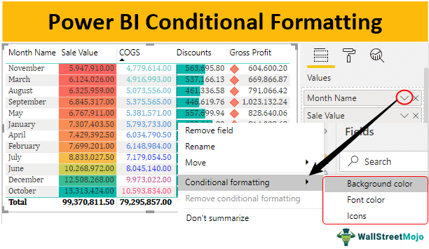
- Below is the table we have already created in the Power BI report tab.

- For the table, we have dragged and dropped the “Sale Value,” “COGS,” “Discounts,” and “Gross Profit” columns from the table.

- To apply conditional formatting in Power BI to this table under the “Fields” section of the table, click on the dropdown icon of “Sale Value.”

- When you click on that down arrow, you will see the below options for this column.

- From the above list, hover on “Conditional formatting,” It will further show many conditional formatting options in Power BI.


As you can see above, we have four conditional formatting types: “Background color,” “Font color,” “Data bars,” and “Icons.”
We will see one by one all the four columns of our table.
Example #1 – Using Background Color
- First, we will apply the background color for the “Sale Value” column. Once again, click on the down arrow of the “Sale Value” column and choose Conditional Formatting and under this, choose “Background color.”

- It will open up below the formatting window.
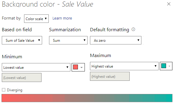
- Under the “Format By” drop-down list, we can choose various other types for this category of conditional formatting and leave it as “Color scale” only.

- Then, make sure “Based on field” has the “Sum of Sale Value,” “Summarization” has “Sum,” and “Default formatting” has “As zero.”

- For “Minimum” values, it has chosen a “Red” color. For the “Maximum” value, it has chosen a “Light Blue” color.

- If you want one more color for middle values, check the box “Diverging” to get the middle-value section.

- Now, click on “OK.” We will have the background color as follows.

Example #2 – Using Font Color
- For the “COGS” column, we will apply “Font color” conditional formatting. Then, from conditional formatting, choose “Font color.”

- It will open up below the window.

- It is similar to the one we have seen above. But this time, as usual, you may choose attractive colors. We have chosen the below color.

- After choosing the colors, click on “OK.” We will have the below colors for “COGS” numbers in the table.

Example #3 – Using Data Bars
- Data bars look like an “in-cell” chart based on the cell value. Therefore, for the “Discounts” column, we will apply “data bars.”
- Click on the down arrow of “Data Bars” and choose Conditional formatting.” Under this category of “Conditional formatting,” choose “Data bars.”

- It will open up below the “Data bars” conditional formatting window.

- In this category, we can choose whether we want to “Show bars only” or we want to show bars along with numbers.

- Since we need to see numbers and bars, let us not check this box. Next, we can choose colors for “Minimum” and “Maximum” values.

- Choose the colors you would like to and click on “OK.” We will have below in cell charts or bars for the “Discounts” column.

Example #4 – Using Icon Sets
- One final category under “Conditional formatting” is “Icon Sets.” These are icons to show against numbers based on the rules specified,
- Click on the down arrow of “Profit” and choose “Conditional formatting.”
It will open below the “Icons” window. Under this, we will define what kind of “Icons” to show under different conditions.
- Under the “Style” category, we can choose a variety of icons to show.

- Choose the best fit for your data sets.
- Under the “Rules” section, we can number ranges or percentage ranges.

- You can set it up as per need. We will have the below icons for the “Gross Profit” column.
Note: To apply conditional formatting, we need data; you can download the Power BI file to get the ready table.
Things to Remember
- The conditional formatting is similar to the one in MS Excel.
- We have four different kinds of conditional formatting options in Power BI.
- We can define rules to apply conditional formatting in Power BI.
Recommended Articles
This article is a guide to Power BI Conditional Formatting. Here, we discuss applying conditional formatting power BI using background color, font color, etc., along with examples and downloadable templates. You can learn more about Power BI from the following articles: –