Create Report on Power BI (Step by Step)
Power BI reports are more visualized in comparison to common reports. In Power BI reports, it is a detailed visualization provided on data. However, some connections need to be made in the data to make a report. In Power BI, reports can be multi-page level or it can be a single page. These pages have visuals.
Suppose you are new to Power BI visualization and wondering what kind of impact Power BI could have on your data analysis, then in this article. We will show you how to prepare Power BI data visualization reports in that case.
To create reports, you need data to work with. So, you can download the Excel workbook from the link below, which is used for this example.

It is the data of credit card transactions done in India. Using this data, we will create a dashboard to get insight into the data.
The steps to create Power BI reports are as follows.
The first thing is to upload the data to Power BI using the “Get Data” option.

Now, you will see a window like the one below.

Our data table name in the worksheet “Credit Card Transactions” is “CreditCard.” So, we have chosen the required table to work with and now click on “Load” to upload the data to Power BI (it will take some time to upload).
In the “Data” layout, you should see the data table like the below one.

Once the data is uploaded, you must return to the “Report” layout to build your Power BI reports and visualizations.

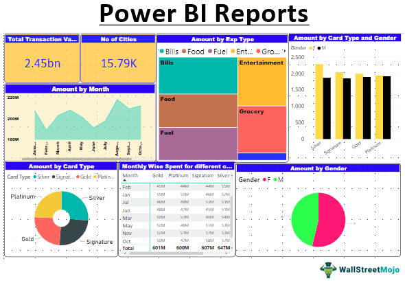
First, we need to show the total credit card usage amount in the year using the “Card” visual.

Drag and drop the “Amount” column to “Fields.”

So, the overall transaction amount is “2 Billion”. Next, we need to design the card for better visualization. Then, remove the category, and add “Title” to the card.
The title can be added and formatted under the “Format” section of the “Card” visual. But, first, you need to format the “Title” of the card, as shown below.

Now, design the background of the card visual.

Now, insert the border for the card.

Now, the number is shown in rounded billions. So, instead of showing rounded billings, let us add decimal places for billions.

Now, copy the already designed card to show the number of cities involved in this transaction.

For monthly spending of amount visualization, choose “Area Chart.” Then, add the “Date” column to “Axis,” retain only “Month,” and add the “Amount” column to “Values.”

If you wish to add some formatting to the chart, you can add it under the “Format” section. For example, we have formatted it like the one below.

Now, to show various expense types choose “Treemap.”

We need to insert values to see the visual. Drag and drop “Exp Type” to “Group” and “Amount” column to “Values.”

If you wish to add some formatting to the report, you can add it under the “Format” section. For example, we have formatted it like the one below. As of now, our report looks like this.

The next visual we will use is the “Donut” chart to show transaction value done by different credit card categories.
Select the Donut Chart first, then drag and drop “Card Type” to “Legend” and the “Amount” column to “Values.”

You can increase or decrease the inner circle of the donut chart under the “Shapes” formatting section.

Use “Matrix” visualization to show monthly-wise spending by different card types. For example, we have four categories of card types: “Silver,” “Signature,” “Gold,” and “Platinum.” So using Matrix, we can create a summary report.

Note: We have done so much formatting to this table. You can download the Power BI dashboard file from the below link and apply each formatting technique.Now, one more visualization we need to add is “Gender” wise spending share in the “Pie” chart. Select the Pie chart as visual and apply the fields accordingly.

To show who uses which card more “Gender-wise,” use “Line and Clustered Column Chart.

So, our first report page is completed and looks like a beauty.

Now, add one more page by clicking the “Add Page” button.

It will add a new page to the right of the active page.

This new page will show the city-wise transaction amount with the “Map” chart.First, add the “Map” chart in Power BI.

Choose the “City” and “Amount” columns to see the bubbles.


So, our Power BI Report is ready to use.
Things to Remember
- We can use any visual but ensure which fits our data.
- Once the visual is used, we need to do formatting touches to make it look beautiful.
- We must always concentrate on how to fill in the page through the size of the visuals we are using.
Recommended Articles
This article is a step-by-step guide to Power BI Reports. Here, we discuss creating custom reports in Microsoft Power BI along with an example and downloadable templates. You can learn more about data visualization from these articles below: –