Pie Chart in Power BI
Pie Chart in Power BI is a built-in visualization chart available with all versions of Power BI. The pie chart is a round-shaped circle chart where each category data set is shown in a pie shape based on the value of each data label. In addition, the pie chart of each category is adjusted against the overall portion of the data labels.
Visuals are eye-catching and can convey the message better than the table alone can tell the story with numbers. So in dashboards, you could see more visuals than a table format summary. One such visual which could be eye-catching is the “Pie” chart. We all have created a Pie Chart in Excel. Now, we will see how we can create the same in Power BI.

How to Create Pie Chart in Power BI?
You can download the workbook used in this example to practice along with us from the below link.
To create a Power BI chart, we need a data set with a minimal number of data labels. Below is the data we will use to create a PIE chart.

- Upload the above data table to Power BI.

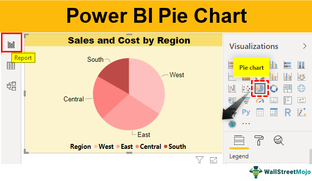
- Open the Power BI file, go to the “Home” tab, and click on “Enter Data.”

- It will open up the “Create Table” window.

- Place your cursor on the first cell, “Column1,” and paste it. Next, give a name to the table as “Pie Table.”

- Click on “Load” to get the data to Power BI, which will be shown Under the “Data” tab.

- Return to the “Report” tab and insert the blank “Pie” chart.

- As soon as you insert the pie chart, we can see its fields on the right side.

- Legend: This is nothing based on what column values we need to see the pie chart. In our example, we need to see the “Region-wise” pie chart. Our legend will be the “Region” column from “Pie Table.”
- Details: If you want to show any further partition of the data you can add here, we will come back to this in the second example.
- Values: This is nothing but what numerical value we need to show in the pie circle.
- Tooltips: This is nothing but adding an extra element to the pie chart when we hover on any of the slices of the pie.
First, drag and drop the “Region” column to the “Legend” field.

- As of now, our pie chart is still a blank one.

- Drag and drop the “Sales” column to the “Values” field.

- Now, our chart looks like the one below.

- Now, hover on any of the pie slices to see data values.

We just hovered on the “yellow” slice in the above image. It shows the region name as “West” and “Sales” value as 250,128, and the percentage contribution as 34.11%.
- However, imagine a situation where we need to see “Cost.” Then, add the “Cost” column to the “Tooltips.”

- Now, hover on any of the pie slices and see the magic.

Since we have added “Cost” to the “Tooltips,” we could be able to see “Cost” as well.
Formatting of Pie Chart
The pie chart looks like the one above, but we can format it to make it look even more beautiful.
- Select the chart and click on the “Format” tab.

As we can see above, we have plenty of formatting options. We will show you one of those in detail.
- Legend: This is nothing, but we have each slice in different colors. Each color represents different “Regions” to see which color represents which region turns on this feature.

- When you further click on the down arrow of this option, we can see other formatting options regarding “Legend” as “Position,” “Title,” “Color,” “Font family,” “Size,” etc.

Like this, we have several other formatting options, so you can choose each and experiment to see its impact.
- We have made some of the formatting to the pie chart. Now, it looks like the one below.

Note: We can also download the Power BI pie chart file from the link below and view the final output.
Things to Remember here
- The pie chart in Power BI is a built-in chart.
- It is a simple chart with drag and drop options.
- Do not use a pie chart when the data labels are more than 10.
- We must always format the pie chart to make it look better, beautiful, and eye-catching.
Recommended Articles
This article has been a guide to the Power BI Pie Chart. Here, we discuss creating a pie chart in Power BI with an example and downloadable template. You may learn more about Power BI from the following examples: –