Examples of Power BI Reports
If you are new to Power BI and wondering how we can create reports in Power BI, then this article is the perfect fit for you. This article will show you how to create examples of reports in Power BI with a simple technique to start learning. You can download the workbook used in this example to practice with us.
How to Create Reports in Power BI with Examples
Here, we will show you how to create examples of reports in Power BI with a simple technique to start learning in Power BI.
#1 – Reports in Power BI
If you are already an Excel reporting generator and advanced formula user in Excel, creating reports in Power BI seems less difficult. So, we assume you are already an advanced Excel user and starting this article.
Below is the data we will use to create a report in Power BI.

Please download the workbook to create a report along with us.
Follow the below steps to upload the data to Power BI from the Excel workbook.
Open Power BI software.
Go to the “Home” tab and find the “Get Data” option.

We can see many data source options when we click on this “Get Data” dropdown list. Let us not get into this as of now. Since our data source is in the form of an “Excel” workbook, let us choose “Excel” only.

Next, it will ask us to choose the file from the saved location, so choose the file from the folder you saved.

Next, click “Open.” It will take you to the “Navigator” pane.

From the “Navigator” pane, we must choose the table we must upload to the Power BI. So, we will choose the “TV_Sales” table and click on “Load.”

Now, you can see your screen will flicker for a few seconds. Then, finally, it will upload to Power BI. By clicking on the “Data” tab, you can see the uploaded data.

We are done with the data upload steps. Now, we need to create some additional columns.
#2 – Create Calculated Columns
If you see the table, we do not have robust data like “Sale Value,” “Gross Profit,” “Gross Profit %,” etc. Therefore, we need to create these columns by using DAX formulas.
- Now come to the “Report” tab.

- On the right-hand side, we can see the table’s fields.

- Right-click on the table name “TV_Sales” and choose “New column.”

- It will ask you to name the column name in the formula tab, so give the name as “Sale Value.”

- By entering what formula do we need to arrive at the “Sale Value”?
- To arrive at the “Sale Value” from the existing columns of the table, we need to multiply “Units Sold” into “Sale Price.”
- Type the characters as “Units.” You will see all the related results. Choose the “Units Sold” column from the “TV_Sales” table.

- Now, enter the “Multiply” sign (*) and choose the “Sale Price” column.

- Press the “Enter” key. The new “Calculated Column” is created in the table.

- Now, right-click and choose “New column” to create the “Gross Profit” value. This time we need to enter the formula: Sales Value – COGS – Discount.

Now, we are done with calculations. But, this is more than enough to start things in Power BI.
#3 – Create Reports in Power BI (By Using Fields)
- By using these fields, we will create reports.
- On the right-hand side, we have several visualizations. From this list, click on the “Table” visual to insert the blank table visually.

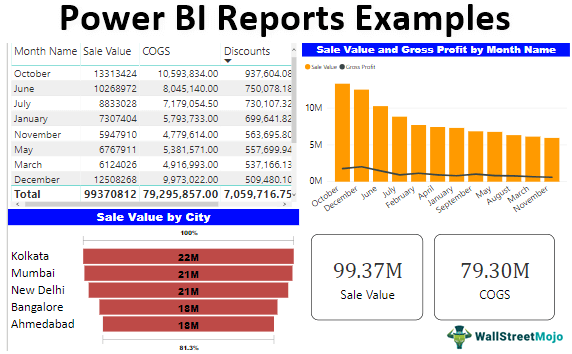
- This table works more or less like the “PivotTable” in our Excel worksheet. Now, drag and drop “Month Name” from the table to the “Values” field of the “Table” visual.

- Now, drag and drop the “Sale Value,” “COGS,” “Discount,” and “Gross Profit” columns to the “Fields” area of the “Table” visual.

- We have a month-wise summary table of “Sales,” “COGS,” “Discount,” and “Gross Profit.”
- We will insert the “Combo” chart for the same fields to see the “Sales vs. Gross Profit.” Click on “Combo Chart” from the visuals list.

- For the fields of this “Combo Chart,” drag and drop columns as shown below.

- It will create a chart like the one below.

- This chart will explain the “Gross Profit” positions against the “Sale Value.” Similarly, we will create a combo chart of “Gross Profit vs. Combo Chart.”

- We will create the “Funnel” chart to create a City-wise “Sale Value.” Click on the “Funnel” chart to create a blank “Funnel” chart.

- Drag and drop the “City” column to the “Group” field and “Sale Value” to the “Values” field. We will have a “Funnel” chart like the one below.

- Ultimately, we will create “Card” visuals to show “Total Sales,” “COGS,” “Discount,” and “Profit” values. Click on the “Card” visual to insert a blank “Card” visual.

- Drag and drop the “Sale Value” column to “Fields.” We will have a simple card showing the overall sales value.

- Now, copy and paste this “Card” visual three more times.

- Now, for the second card, change the field from “Sale Value” to “COGS.” For the third, change it to “Discounts.” Finally, for the fourth, change it to “Gross Profit.”

- Overall, we have a simple power bi dashboard like the below one.

Note: We can also download the Power BI dashboard file from the link below. We can view the final output.
Things to Remember
- If the required column is not in the data, we must create the one using DAX formulas.
- The visual we use for the particular data set makes a lot of difference in the dashboard.
Recommended Articles
This article is a guide to Power BI Reports Examples. Here, we show you how to create Power BI reports with examples and step-by-step explanations. You may learn more about Power BI from the following articles: –