Power BI Matrix Visual
Matrix is a visualization type available with Power BI. Using this visualization; we can create summary reports with simple drag and drop options. We can call it a “power bi version of pivot table”. It works exactly similar to the pivot table but not exactly a typical PivotTable with MS Excel. Nevertheless, it is a built-in visual available in Power BI.
One common question for beginner Power BI is, can we use the “Pivot Table” stuff in Power BI to summarize the data? The answer is “we can use a PivotTable with Power BI to summarize the data”. Not a like-for-like replacement, but at least basic level PivotTable summarization is possible with Power BI using Matrix visual.
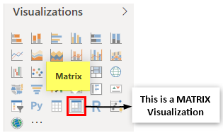
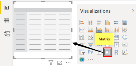
To work with the Matrix visualization, we need to understand the fields of this visual. Insert a blank Matrix visual to see its fields.

A simple three fields are available with the Matrix visual. But, first, let us look at each field’s meaning to create a summary table.
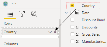
- Rows: When creating a PivotTable, we must drag and drop column fields appearing in rows. So, similarly, for this field of “Matrix,” we need to drag and drop the column which needs to be summarized with rows.
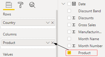
- Columns: Like Rows which column needs to be shown as “Column” will be dragged and dropped to this field.
- Values: This is nothing but the “Value Column,” which needs to be summarized. For example, “Sales Column,” “Cost Column,” “Profit Column,” etc., based on the requirement.
How to Create Matrix Visual in Power BI? (Examples)
You can download the workbook and use the same data.
To create a matrix visual, we need some data. Therefore, we have created dummy data to demonstrate this visual.
Follow the below steps to create a matrix visual in Power BI.
- We have already uploaded the data to the Power BI desktop. It looks like this.
Using this data, we need to create a summary table.

- To insert the blank “Matrix” visual from the visualization list.

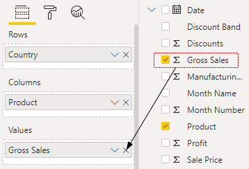
- For the “Matrix” row field, we must drag and drop the “Country” column.

- For the “Columns” field, drag and drop the “Product” column.

- For the “Values” field, drag and drop the “Gross Sales” column from the Data Table.

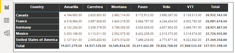
- It will create a “Matrix” visualization in Power BI like the below one.


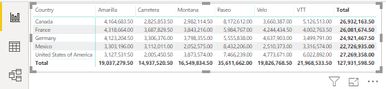
It looks like our PivotTable in Excel.
Once the visual is created, we need to play with its formatting to make it look good, clean, and neat.
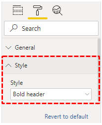
- By selecting the visual, click on the “Format” tab.
- The first thing we need to do is “Style” the “Matrix” visual. Then, click on the dropdown list of the “Style” formatting option, and choose “Bold header.”
- Now, the matrix table is formatted like the below.
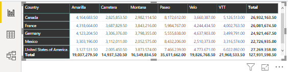
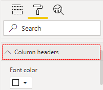
We can also change the “Column Header” font size, font color, font name, background color, etc. We have set the formatting options below under “Column headers.”
- Font: Segoe (Bold)
- Text Size: 12 Pt
- Alignment: Centre
- And this will format the table like this.
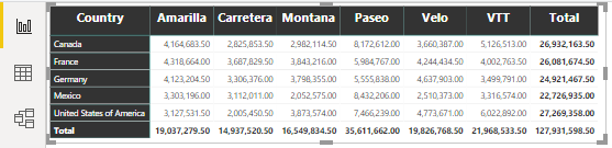
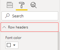
Similarly, for “Row headers,” apply the changes mentioned above for “Column headers.”
We have applied the same changes for “Column headers,” so our table now looks like this.

Now, we need to increase the font size of values. So, click on “Values” formatting and apply the below changes.
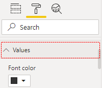
We have just increased the font size to 12m. If you wish to have other formatting options, you can try all of them.
Now, our table looks like this.
Add Drill Down to Matrix Visual
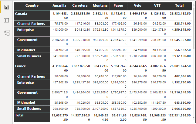
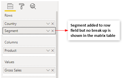
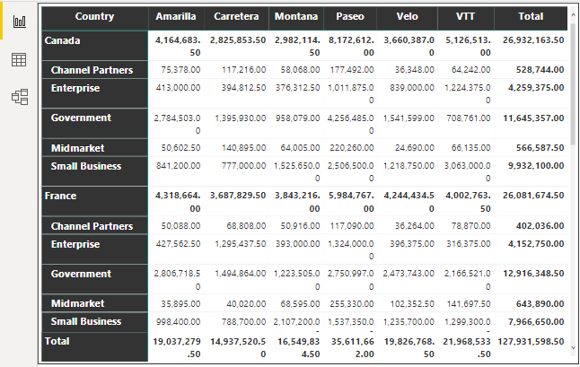
One of the problems with Matrix visual is it will not work as a PivotTable because if you add the “Segment” column to see the break-up sales for each country, it will not give the break-up summary.
- But one of the flexible things it will give us when we add more than the one-row field is enabling the “Drill Down” option.
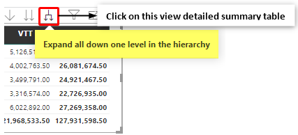
- Click on the above drill down option to see the break-up.
- Again, go back to the last option, the “Drill Up” option.
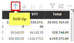
It will bring back the old table summary without any break-up.
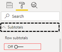
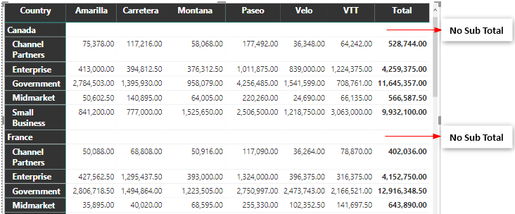
- In the “Drill Down,” if you do not wish to have “Sub Totals” then under the “Format” tab, turn off the “Row Subtotals” options.
- It will remove row-level subtotals.
Using the “Matrix” visual, we can create the PivotTable summary table in Power BI.
Note: We can also download the Power BI dashboard file from the link below. We can view the final output.
Things to Remember
- The Matrix visual works like a PivotTable.
- To view subtotals, we must add columns to respective fields and turn on the “Drill Down” option. We can tune on “Drill Up” to cancel this option.
Recommended Articles
This article has been a guide to Power BI Matrix. Here, we learn how to create a matrix visual in Power BI, add drill down, and drill up to the matrix visual along with examples. You may learn more about Power BI from the following articles: –