Table Of Contents
What is a Power Bi Icon Set?
Icons are the visual representation of any content or a data header. In Power BI, some built-in icons that any user can use. Also, we have options to make custom-made icons in Power BI. It is a new feature that has been added to Power BI.
Icon sets are similar to those we used on Excel conditional formatting. Icon sets represent the data through icons available in Power BI.
![]()
We are sure you have enjoyed the thing “Conditional Formatting” brings to the table in Excel. By setting our conditions, we can decide the formatting style for our numbers. We can do the same with Power BI visualization if you use advanced conditional formatting in Excel.
Now, many of those who use Power BI are unaware that we can apply conditional formatting in Power BI. For example, we can apply icon sets to our data set numbers using these visuals. This article will show you how to use “Power BI Icon Set” to apply conditional formatting.

History of Power Bi Field Icon Set
First thing first, “Icon Sets” in Power BI can be applied to “Table” and “Matrix” visuals. In July 2019, Microsoft released this new feature for Power BI. So, download and install the latest version to use the “Conditional Formatting” in Power BI.
Based on users’ feedback and ideas, Microsoft improves its product features every month, and here you go, “Icon Set” is one of them.
How to Apply an Icon Set in Power Bi?
You can download the workbook used in this example to practice with us.
As we said, conditional formatting can be applied to the “Table” and “Matrix” visual. To demonstrate the icon set in this article, we have created a simple “Table” visual below.

We will apply the “Icon Set” for this table based on the below rules.
- If the Amount is <=195, the icon will be the “Red” color icon.
- If the Amount is >=196 and <=200, the icon will be in “Yellow.”
- If anything >200, then the color will be “Green.”
Applying “Icon Set” to select the “Table” visual will show the fields used from the table to create this visual.

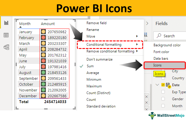
- Since our numbers are in a table based on "Amount," click on the dropdown list "Amount" and choose "Conditional formatting."

- So, choose "Icons" from the "Conditional formatting" options to open the below windows.

- In this, we need to define our rule, so make sure we select the "Format by" dropdown list with "Rules."

- We need to select based on which field of the table we are applying icons, so select the "Sum of amount" column under the "Based on field" option.

Next, we must select the kind of summarization we need to apply. From this dropdown list, we can choose "Overall Sum Value," "Average," "Minimum," "Maximum," etc. Like this, we can choose many options, as shown below.
- Since we need icons based on the overall value, I have chosen "Sum."

- Now, we need to choose the icon's position in the table. From this dropdown, we can choose the icon's position as "Right of data" or "Left of data." You can choose the "Icon Only" option if you want to see only icons.

- Next, we must choose the "Icon alignment" position as "Top," "Middle," or "Bottom."

- Now comes the icon part. Under "Style," we can choose what kind of icon we need to show on the table.

- As you can see above, we have several icons available. You can choose any of them based on the data. Since we have only three rules, we have chosen the icon below.

Now, we need to apply the rules we defined earlier.
- We will go from bottom to top. But, first, we will define the rule as follows.

Now, let me explain the rule to you.
“If the value is >= 0 (percent) and <= 40 (percent) then we need “Red” color traffic signal”.
“If the value is >= 41 (percent) and <= 70 (percent) then we need “Yellow” color traffic signal”.
“If the value is >= 71 (percent) and <= 100 (percent) then we need “Green” color traffic signal”.
- Click on "OK." We should get traffic lights as per the defined rule.

We got our first-ever icon set in Power BI.
Like this, you can use other icon sets to apply conditional formatting for the data in Power BI.
Note: We can also download the Power BI icon file from the link below. We can view the final output.
Things to Remember Here
- The icon sets are part of "Conditional formatting" in Power BI, just like the MS Excel feature.
- The icon sets and conditional formatting can be applied only to "Table" and "Matrix" visuals.
- It would help if we defined the rule to assign a specific icon to a specific set of values. Else, Power BI applies its icons.
