What is Power BI KPI?
KPI is a key performance indicator. Although in Power BI, there are some specific requirements for this type of KPI visualization, the mandatory requirements are a base context that is used to compare a given value to a target concept known as the threshold.
Having KPI in Power BI Dashboards is a smart way to analyze the data. Every organization should monitor its progress toward the set of standards at the start of every financial or fiscal year. So, tracking how a business is moving towards its set of targets is the duty of every analyst in the company. of targets is the duty of every analyst in the company. Using Power BI visualization we can create this visual to see the real impact of the target vs. the actual report. We will see simple data of every month’s target vs. the actual report to build a KPI visual in Power BI.
Examples to Build KPI Visual in Power BI
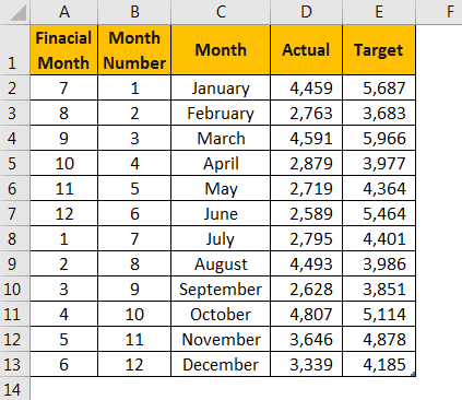
To build KPI visuals, we need some data first. Below is the simple data you can use to build KPI visuals.
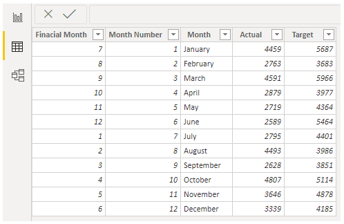
Copy and paste the data directly to Power BI. Else, you can copy it to an Excel file and then import it to Power BI as an Excel file reference. So, you can download the Excel workbook template from the link below, which is used for the example of the Power BI KPI visual.
We have directly uploaded the Excel file to Power BI. Under the “Data” section, we can see this table.
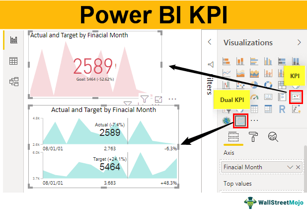
Example #1 – Simple KPI
Follow the below steps to create KPI.
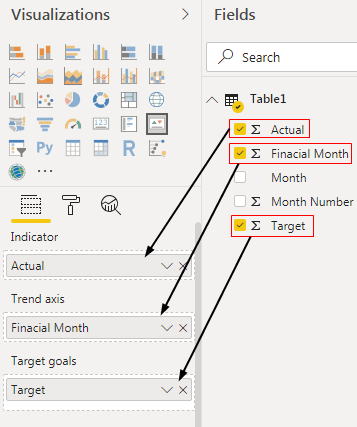
1. Go to the “Report” view and click on the “KPI” visual. For this, we have three sets of data fields to be inserted: “Indicator,” “Trend axis,” and “Target goals.”
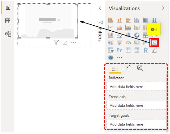
- Indicator: This is nothing but what are the actual values that indicate against the targeted goals.
- Trend Axis: This will be our month names or number, which will not show on the horizontal axis.
- Target Goals: This does not require any special introduction. It will be our target column against the indicator.
2. Now, select the inserted Power BI KPI visual. Next, drag and drop “Financial Month” to the “Trend axis,” “Actual” column to “Indicator,” and “Target” column to “Target goals.”
3. It shall create a Power BI KPI chart like the below one.
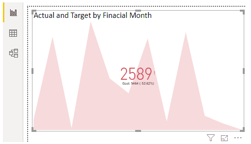
So, our KPI graph is ready to read. It is a built-in KPI chart. Apart from this, we can install various other charts from the marketplace of Microsoft.
This topic opens up many avenues for further exploration. If you’re intrigued by these concepts, this advanced Power BI course might provide additional insights and hands-on experience.
Example #2 – Dual KPI
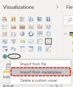
Follow the below steps to install custom visuals from the marketplace.
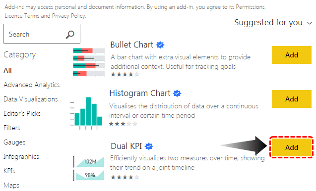
Step 1: Click on three horizontal dots under visualizations and choose “Import from the marketplace.”
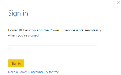
Step 2: Now, it will ask you to sign in. It would help if you used any school or organization ID to sign in. It will ask you to sign up if you do not have an account.
Step 3: Once you sign in, it will take you to the marketplace, where we can import custom visuals. You must click the “Add” button to keep adding to your visualization list. Here we have added the “Dual KPI” visual.
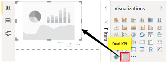
After adding, we can see these visuals under the visualization list. But, first, we must create a “Dual KPI” chart to show the target vs. actual graph.
- Insert a Dual KPI chart visualization.
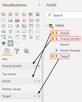
- Now drag and drop the fields, as shown below.
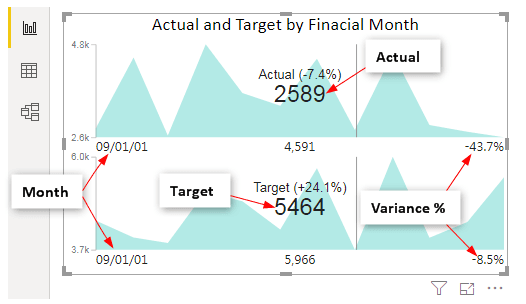
- So, our Power BI Dual KPI chart will look like this.
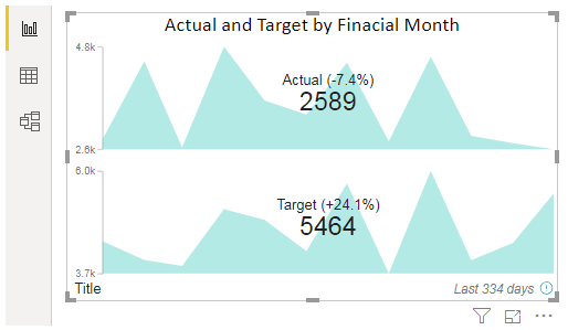
The beauty of this chart is that when we hover our cursor, it will show the respective month target and actual values and the variance %.
- Here, we have placed my cursor on the “September” month, and we can see the KPI numbers for this month.
Like this, we can create KPI charts in Power BI software to visualize target vs. actual data.
Note: We can also download the Power BI KPI dashboard file from the link below and view the final output.
Things to Remember
- KPI requires accurate data to create Power BI KPI visuals.
- The default KPI often misleads the reader because it does not show the target axis line.
- We can import custom visuals from the marketplace to create different kinds of KPI charts or visuals.
Recommended Articles
This article is a guide to Power BI KPI. Here, we discuss how to build a KPI and Dual KPI visual in the Power BI dashboard with the help of a step-by-step example. You can learn more about Power BI from the following articles: –